
Seattle's Best has rebranded themselves. It's current, it's fun, and it was very much so needed.
What a drastic difference, am I right?
Along with their branding, it only makes sense that new packaging has also been introduced.
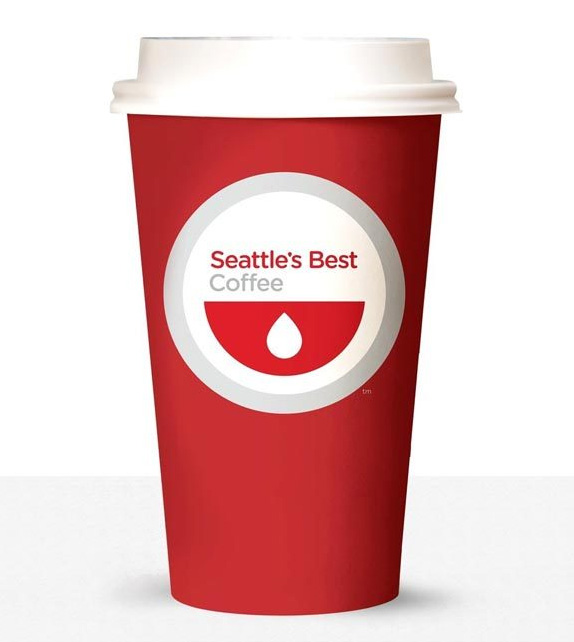

Overall, I think it's a definite improvement. The main crit I have is that the logo is reminiscent of healthcare and blood donation, and many comments on sites and blogs agree with that notion. Obviously, red is a huge part of their brand and had to incorporate it, but the red semi-circle could easily be changed to brown to obviously represent coffee (maybe that was too cliche for them? Who knows?!). Yet again, it is supposed to represent a smile, and the drop kind of seems like an implied tongue as well. There are just so many ways to look at it!
I really appreciate the coffee bag the most: nice repetition of the circles, varying type weight to show hierarchy, clean in general.
Here's a chart of their design reasonings:
What are your thoughts on Seattle's Best rebranding? Yay or nay? Any other crits to offer?
Edit: I didn't realize how far behind I was with this, but in my defense, there are about zero Seattle's Best coffee shops in the Atlanta-area.
No comments:
Post a Comment